

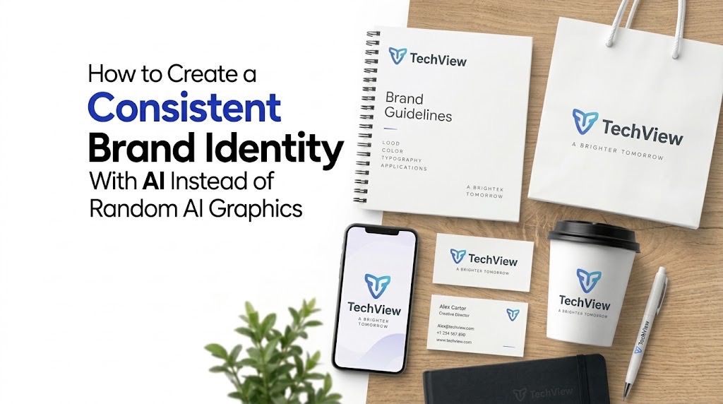
Consistency comes from reusable rules, not from repeatedly asking AI to “make it look professional.”
AI Can Make Good Graphics and Still Damage Your Brand
Do not begin with prompts. Build a small brand system first: approved colours, fonts, logo rules, image style, layouts and reference examples. Then reuse those same constraints whenever AI creates a social post, advert, presentation or campaign graphic.
A business can now generate a product banner, Instagram post, event flyer and website illustration in minutes. The problem appears when every image looks as though it came from a different company.
One graphic is dark and cinematic. The next uses pastel gradients. Another introduces a different typeface, illustration style and colour palette. Each may look polished on its own, but together they do not create a recognisable brand. The fix is not a more elaborate prompt. It is a brand system that the AI has to work inside.
Canva describes its Brand Kit as a central place for logos, colours, fonts, imagery and guidelines, while Adobe Firefly allows a reference image to influence colour, texture, lighting and other stylistic qualities across multiple generations. Figma similarly treats shared colours, typography, components and other reusable assets as the foundation of a consistent design system.
For a small business, you can apply the same principle without building an enterprise design department.
Start With Six Decisions Before You Generate Anything
Create a one-page visual brief containing:
- Logo rules: approved logo versions, minimum spacing and backgrounds where the logo should or should not appear.
- Colour palette: one or two primary colours, supporting colours and exact HEX values.
- Typography: one headline typeface, one body typeface and clear rules for size and weight.
- Image direction: decide whether your brand uses realistic photography, clean studio imagery, illustration, 3D graphics or another defined approach.
- Composition: establish recurring choices such as generous empty space, centred products, left-aligned headlines or restrained backgrounds.
- Things to avoid: colours, effects, visual clichés, excessive gradients, fake interface elements or styles that do not belong to the brand.
This becomes the reference point for every AI-generated asset. The same principle applies when using AI for more specialised creative work. TechView Africa’s guide to creating professional product images with AI recommends preserving the real product while letting AI change the scene around it. Our guide to creating professional AI presentations without the generic AI look similarly keeps human control over visual hierarchy and final design decisions.
Build a Reference Set, Not Just a Prompt
Once you have three to five graphics that genuinely represent the brand, save them as your approved reference set.
A text prompt such as “create a premium technology advert” leaves enormous room for interpretation. A reference image narrows that space.
Adobe Firefly’s Style Reference feature, for example, can reuse the visual characteristics of an existing image across new generations. Adobe also offers Style Kits for eligible enterprise users, allowing teams to preserve approved generation settings and reuse them.
The broader lesson applies regardless of the AI tool: reuse successful visual decisions instead of describing your brand from scratch every time.
Your working instruction might therefore say:
Use our approved dark background, restrained typography, warm photographic lighting and spacious editorial composition. Keep the subject realistic, avoid neon effects, excessive icons and futuristic holograms, and preserve clear space for the headline.
That is much more useful than “make a beautiful professional graphic.”
Create Templates for Repeated Content
Not every design should be generated from zero. Create fixed templates for content you publish repeatedly: announcements, job posts, quotations, product promotions, article cards or event graphics.
Keep logo position, typography, margins and colour treatment stable. Let AI change the photograph, illustration or supporting visual where variation is useful.
This is where tools such as Canva’s Brand Kit and Figma design systems become useful: approved assets and reusable rules can live somewhere the person creating the next graphic can actually access.
For a growing business, consistency also becomes an operational issue. If five people are producing content, they should not each be inventing what the brand looks like.
Review the Set, Not Only the Individual Image
Before approving an AI-generated graphic, place it beside five recent brand assets. Ask whether they look like they belong to the same organisation.
Check the colours, typography, photography, spacing, logo treatment and overall mood. A graphic can be attractive and still be wrong for your brand. This simple comparison is one of the best defences against gradually drifting into whatever visual style the AI happens to generate that day.
Our Recommendation
Use AI to expand a visual identity, not invent a new one every time you need content.
Create the smallest useful brand system first, keep a reference set of approved graphics, build templates for recurring formats and reuse the same visual constraints across prompts and tools. AI becomes far more useful once it is producing variations of a recognisable system instead of an endless stream of unrelated designs.
Sources & Verification
Canva — How to Set Up Your Brand System Before Using AI
Canva Design School — Brand Kits: The Foundation
Adobe Firefly — Style Reference Images
Frequently asked questions
Can AI create a complete brand identity on its own?
AI can help generate visual directions, graphics and variations, but a consistent brand still needs human-defined rules for colours, typography, logo use, imagery and layout. Without those constraints, AI tends to produce attractive but inconsistent results.
What should I prepare before using AI for brand graphics?
Create a basic brand guide first. At minimum, define your logo rules, primary colours, fonts, preferred image style, common layouts and visual elements you want to avoid.
How do I stop AI-generated graphics from looking different every time?
Reuse the same reference images, colour palette, typography, layout rules and prompt structure. Templates and saved brand assets also help reduce visual drift between designs.
Do I need Canva, Adobe Firefly or Figma to build a consistent AI brand system?
No. Those tools can make the process easier, but the underlying method works with any AI design tool: define the brand system first, save approved references and reuse the same visual rules consistently.
How many reference images should I keep for my brand?
A small set of three to five strong examples is usually enough to establish the visual direction. Choose examples that clearly represent the colours, composition, typography and image style you want future graphics to follow.
How to Create a Product Launch Video With AI From Assets You Already Have
How to Apply for Nigeria’s National AI Innovation Challenge 2026

Before You Connect AI to Your Email, Files or Photos, Check These 5 Things

ECOWAS Recruitment 2026: 6 Abuja Jobs, Eligibility, Deadline and How to Apply

50 Remote AI Jobs and Expert Projects Open Across Micro1, Mercor, Outlier and Handshake AI

Seven Free AI Tools That Are Actually Useful on a Smartphone

How to Create a Professional Proposal With AI From a Client Brief Without Inventing the Details
Follow TechView Africa on WhatsApp
Get TechView Africa updates on WhatsApp. Follow our channel for practical technology news, product guides and digital trends from Nigeria and across Africa.
Leave a comment
Comments cannot be edited or deleted after posting. Please review your comment before submitting.
No comments yet. Start the conversation.