

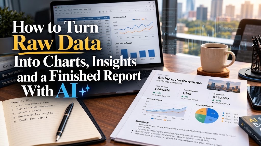
AI can shorten the journey from spreadsheet to finished report. It cannot decide whether messy data is trustworthy, whether a chart answers the right question or whether a plausible explanation is actually supported by the evidence.
How to Analyse Raw Data and Build a Professional Report With AI
Start by preserving the original file and cleaning a working copy, then define the questions the data needs to answer. Use AI to explore patterns, generate calculations and create charts, but verify every important figure against the source before turning the findings into a structured report.
A CSV file with 20,000 rows may contain valuable information, but handing those rows to a manager is not analysis. The useful output is the explanation: what changed, what matters, what may have caused it, what remains uncertain and what someone should do next.
AI can now accelerate much of the work between those two points. Microsoft's current Copilot tools can answer natural-language questions about spreadsheet data and return summaries, trends, outliers, PivotTables and charts. For more complex questions, Copilot can use Python-based analysis and expose the underlying code. The advantage is speed. The danger is producing a polished report before anyone has established whether the data deserves to be trusted.
Start with the raw file, but do not work directly on it
Keep the original CSV or workbook unchanged. Create a working copy and begin with an audit.
Look for duplicated records, blank fields, inconsistent labels, dates stored as text, numbers stored as strings, impossible values and columns whose meaning is unclear. “Lagos”, “lagos” and “Lagos ” may represent the same place while appearing as separate categories. A missing cost can make a profit calculation incomplete. A duplicated transaction can inflate revenue without making any chart look obviously wrong.
Excel includes dedicated duplicate-removal tools, but Microsoft itself recommends reviewing duplicates before deleting them because removal permanently changes the data.
A useful first AI instruction is:
Audit this dataset before analysing it. Identify duplicate rows, blank fields,
inconsistent category names, suspicious dates, impossible values and columns
that could distort the analysis. Do not delete, replace or infer missing values
without showing me what you found first.
That final sentence matters. Cleaning should correct known problems, not convert unknown information into invented information.
TechView Africa's earlier experiment with 500 deliberately messy sales rows and Excel Copilot reached the same conclusion: an attractive dashboard can still be unreliable if the source rows are wrong.
Decide what you need to know before asking AI what it notices
“Analyse this spreadsheet” is a convenient prompt, but it is rarely a good analytical brief.
Start with decisions. If the file contains sales data, useful questions might concern whether revenue is rising or falling, which products are driving the change, which regions are underperforming, whether profitability is moving with sales and whether unusual transactions are distorting the result.
AI is particularly useful for exploration because you can continue asking follow-up questions. Microsoft documents examples ranging from comparing regional performance to identifying anomalies and calculating summary statistics.
Try something narrower than “find insights”:
Compare monthly revenue and profit. Identify the three largest changes,
show which products or regions contributed most to each change, and flag
anything that could be caused by missing or unusual records.
The question determines the analysis. The AI should not determine the business question simply because it found an interesting correlation first.
Use deeper analysis only when the question needs it
Many business questions do not require Python. Totals, percentages, rankings, monthly trends and category comparisons can often be handled transparently with spreadsheet formulas, PivotTables and ordinary charts. That transparency is valuable because another person can inspect how the number was produced.
When the question becomes more complicated, Microsoft says Copilot can perform Python-based analysis and move into an advanced-analysis mode that creates a separate sheet containing the underlying Python work. That can help with deeper exploratory analysis, forecasting, clustering and more complex relationships. Use that capability because the question requires it, not because Python makes the report appear more sophisticated.
Choose the chart from the question, not from what looks impressive
A chart should make an answer easier to see.
| Analytical question | Usually useful visual |
|---|---|
| How did something change over time? | Line chart |
| Which category is larger or smaller? | Bar or column chart |
| How is a total divided among a few categories? | Stacked bar or carefully used pie/donut |
| Are two numerical variables related? | Scatter plot |
| How are values distributed? | Histogram |
| What is the single headline figure? | Number or compact summary table |
Copilot can create charts from natural-language instructions and can also build PivotTables, highlight values, sort and filter data. Microsoft nevertheless explicitly tells users to review AI-generated output. Avoid turning every finding into a chart. If the answer is “refunds increased from 2.1% to 2.4%”, a sentence may communicate it more effectively than another visual.
A chart is not yet an insight
Suppose the chart shows sales falling sharply in one region. The chart establishes the pattern. It does not automatically establish the reason. Ask AI to investigate what changed in the underlying rows, but require it to separate observations from explanations:
Explain the decline shown in this chart using only evidence available in
the workbook. Separate confirmed findings from possible explanations.
For every numerical claim, identify the fields or calculation behind it.
An insight should normally connect a result to its context: what changed, by how much, compared with what, where the change occurred and what evidence supports the interpretation.
“North region performed badly” is weak.
“North region revenue fell 18% from Q1 to Q2 while the other three regions grew, with most of the decline concentrated in two products” is analytical—provided every number survives verification.
Fact-check the analysis before asking AI to write the report
This is where many AI workflows go wrong. Once the model produces a convincing explanation, there is a temptation to move directly to presentation. Instead, return to the spreadsheet.
Recalculate the headline figures independently. Check the date range. Confirm the denominator behind percentages. Filter the source records behind unusual findings. Make sure missing values were not silently excluded. Check whether “average sales” means average transaction value, average monthly revenue or something else entirely.
The same verification discipline applies to AI-assisted data analysis as to research generally. TechView Africa's guide to using AI for research without repeating its mistakes explains why fluent output should never be treated as evidence by itself. Sensitive business data deserves another check before it is uploaded anywhere. Payroll, customer information, confidential prices or banking data may require redaction or an organisation-approved environment. TVA's guide on information you should not casually upload to an AI tool covers that risk separately.
Turn the verified analysis into a report, not a dump of findings
Once the numbers are stable, the report should tell a short argument. A practical management report can move from executive summary → data and scope → major findings → charts and interpretation → implications → recommendations → methodology or appendix.
The executive summary should contain the answer, not an introduction to the process. A manager should be able to read the first few paragraphs and understand the most important finding, the evidence supporting it and the decision that may follow. Charts can then provide evidence beneath those conclusions.
For Microsoft 365 users, Excel charts can be pasted into Word while remaining linked to the source workbook, allowing the chart to update when the underlying Excel data changes.
Microsoft now also documents Word, Excel and PowerPoint Agents that can use existing files to generate documents; one of Microsoft's own examples is using Q3_sales.xlsx to produce a summary report with charts. Microsoft notes that these agents require a Microsoft 365 Copilot licence and that generated files should be reviewed before sharing.
That capability can shorten the final production stage. It does not remove the analyst's responsibility for the numbers.
A report and a dashboard solve different problems
A dashboard is designed to be revisited. It lets someone monitor metrics, change filters and inspect what is happening now. A report is designed to explain. It selects the evidence, interprets the important changes, acknowledges limitations and leads the reader towards a decision. The underlying spreadsheet may contain 50 useful observations; the finished report may need only five. That selection is not wasted information. It is the analytical work.
Our Recommendation
Use AI across the entire data-to-report workflow, but give it different levels of authority at different stages. Let it help discover data-quality problems, formulate calculations, explore patterns, generate candidate charts and improve the first report draft. Keep human control over what missing data means, which metrics matter, whether an apparent relationship is meaningful, which findings deserve emphasis and whether the final numbers can be traced back to the source.
A good AI-assisted report should survive a simple question from the person receiving it: “Show me where this conclusion came from.” If the spreadsheet, calculation and chart can answer that question, AI has accelerated the analysis without replacing accountability.
Sources & Verification
Microsoft — Get data insights with Copilot in Excel
Microsoft — Get direct answers to data analysis questions in Excel
Microsoft — Visualise your data with Copilot in Excel
Microsoft — Find and remove duplicate values in Excel
Frequently asked questions
Can AI analyse a CSV file and create charts?
Yes, once the data is opened or imported into a supported analysis environment. In Excel, Copilot can answer questions about structured table-like data and produce summaries, PivotTables, trends, outliers and visualisations. The source data should still be checked before relying on the results.
Should I clean the data before asking AI to analyse it?
Yes. At minimum, inspect duplicates, blanks, inconsistent labels, date formats, data types and values that could distort important calculations. AI can help identify these problems, but it should not invent missing information simply to make the dataset complete.
Do I need Python to analyse business data with AI?
Usually not. Formulas, PivotTables and ordinary charts remain sufficient for many reporting tasks. Python becomes useful when the question requires deeper statistical analysis, forecasting, clustering or other techniques that are difficult to express transparently with basic spreadsheet tools.
Can Copilot create a finished report from an Excel file?
Microsoft documents Copilot agents that can use an existing spreadsheet to generate a report with charts, subject to licence and availability requirements. Treat that output as a first draft: verify the calculations, wording and recommendations before giving it to a manager or client.
What is the biggest risk when using AI for data analysis?
A plausible result based on unreliable data. AI can analyse the rows it receives very quickly, but it may not know whether a duplicate is intentional, whether a blank means zero or unknown, or whether a business definition has changed. Those decisions still require human judgement.

How to Create a Consistent Brand Identity With AI Instead of Random AI Graphics

How to Apply for Nigeria’s National AI Innovation Challenge 2026

Before You Connect AI to Your Email, Files or Photos, Check These 5 Things

Meta Wants Muse to Help Run Small Businesses. Here’s What Owners Should Keep Under Human Control

50 Remote AI Jobs and Expert Projects Open Across Micro1, Mercor, Outlier and Handshake AI

Seven Free AI Tools That Are Actually Useful on a Smartphone

Data Analysis, Cybersecurity or Cloud: Which Has the Friendliest Entry Point for Beginners
Follow TechView Africa on WhatsApp
Get TechView Africa updates on WhatsApp. Follow our channel for practical technology news, product guides and digital trends from Nigeria and across Africa.
Leave a comment
Comments cannot be edited or deleted after posting. Please review your comment before submitting.
No comments yet. Start the conversation.